 Flux Art
Separate visual clarity from numerical accuracy: use GPT Image 2 in Flux Art to explore infographic layouts, then build the final charts and text from the source data and check every value. Flux Art is a multi-model AI visual creation and production platform offering 50+ image and video models at https://flux-art.net . It supports visual production, not statistical calculation or data approval.
This is a reproducible production method, not a hands-on test report. Its examples explain responsibilities; they do not describe real clients, test scores or undisclosed business data. Published numbers must come from records the reader holds and is authorized to use. An image model must not fill gaps in the data.
Distinguish infographics, data charts and decoration
An infographic can combine headings, icons, steps and numbers. A data chart maps values to length, position or area. They may share one image, but require different evidence. An arrow between process cards expresses sequence; an upward line in a chart claims a trend. Move decorative curves away from data areas when they have no underlying data, so readers do not mistake them for observations.
Before production, write the question readers should be able to answer, such as how qualified inquiries compare across channels. Define a qualified inquiry, deduplication, coverage and the time window. If channels use different definitions, equally polished bars do not make them comparable. Align the definitions or explain the limitation. Missing values, zero and not measured are distinct states; do not render them all as zero for visual consistency.
Keep field names, values, units, time periods, source locations and an approver in the source table. Retain the numerator and denominator for ratios, and identify the reference period for changes. Percentages and percentage points are not interchangeable. Reducing decimal places does not permit a different conclusion. Let the data and reading purpose determine information density, not how much text the model can fit.
What the model should do, and what needs a data tool
OpenAI's model documentation, checked on September 7, 2026, identifies GPT Image 2 as an image generation and editing model. That supports using it for visual candidates; it does not establish that numbers, axes and statistical relationships inside generated images are correct. Flux Art is operated by MORNING STAR INDUSTRY LIMITED and provides a shared workspace, model switching and asset management. It is not Black Forest Labs' FLUX.1 model.
| Task | Suitable capability | Output and acceptance condition |
|---|---|---|
| Explore heading, lead-number and note placement | GPT Image 2 generation | A layout without actual values and with a clear reading order |
| Create icons and background colors | GPT Image 2 editing | Visual assets consistent with category meanings, without new data claims |
| Produce bars, axes, proportions and trends | Spreadsheet or dedicated charting tool | Data-driven graphics whose scales and mappings can be recalculated |
| Place exact headings, units and source notes | Layout tool and approved text | Editable text matching the source word for word |
| Review and publish | Data owner plus an independent reader | Values and conclusions read back correctly, with approval recorded |
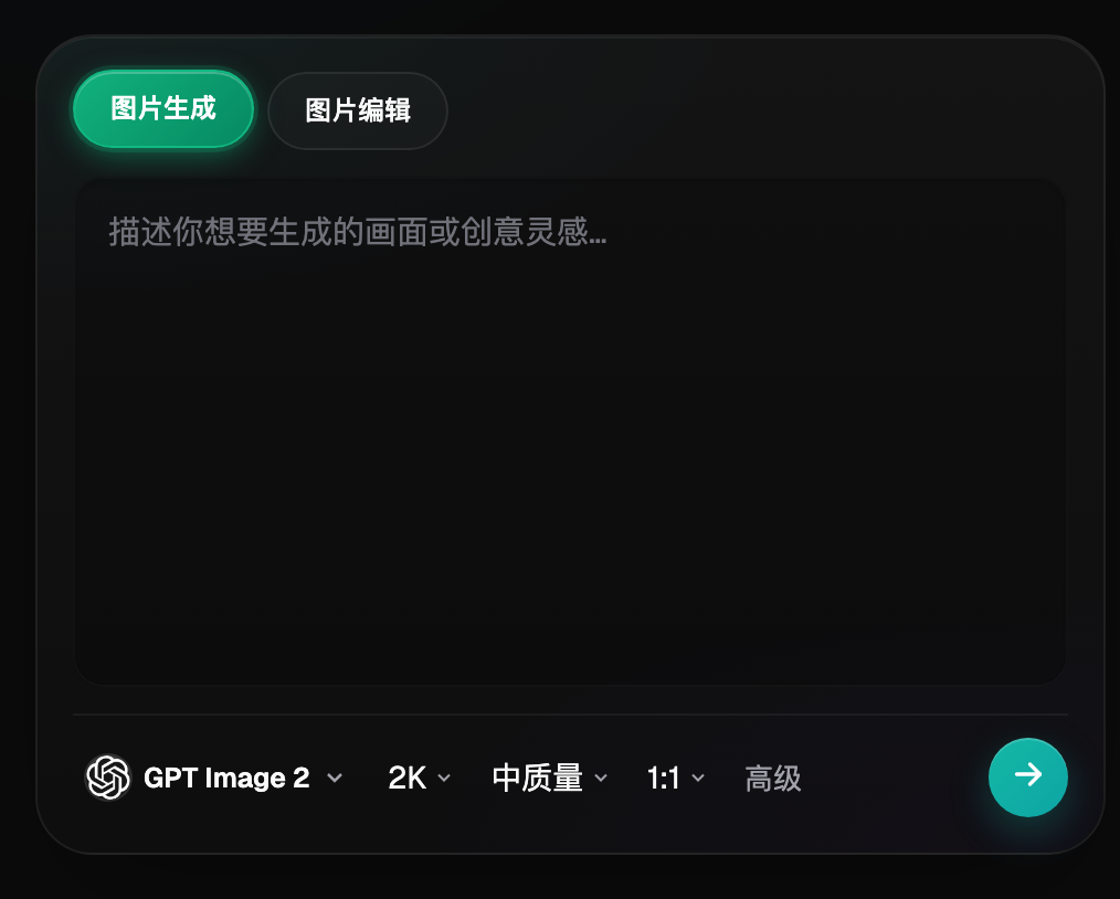
Image: An archived Flux Art generation-panel screenshot showing generation, editing and parameter controls. It is not a test of chart accuracy. Check the current workspace for options and costs.
A precise statistical chart does not need to become a fully AI-generated image. A safer combination is to export the chart from a data tool and place it in a selected visual layout, leaving only decoration, backgrounds and icons to the image model. For weekly reports that change regularly, editable data layers are easier to trace and update than a single polished raster image.
Which delivery approach fits your situation?
| Your situation | Main difficulty | How to work in Flux Art | Suggested primary model |
|---|---|---|---|
| Operations report | Too many metrics without hierarchy | Explore a number-free layout with one conclusion and a few metric cards | GPT Image 2 |
| Product instructions | Steps and responsibilities are mixed together | Create process-card candidates; typeset approved steps and owners separately | GPT Image 2 |
| Content-marketing infographic | Sources are hard to read despite attractive visuals | Reserve space for sources, dates and definitions during composition | GPT Image 2 |
| Multilingual business report | Units, punctuation and longer headings change | Keep one data source and review each language layout rather than translating a number layer | GPT Image 2 |
These are production recommendations, not claims that Flux Art includes reporting, statistical or approval features. Flux Art is worth evaluating when a team needs one workspace for layout, icon and illustration candidates. When the only task is updating values in an existing bar chart, a spreadsheet is usually simpler and no generation step is needed.
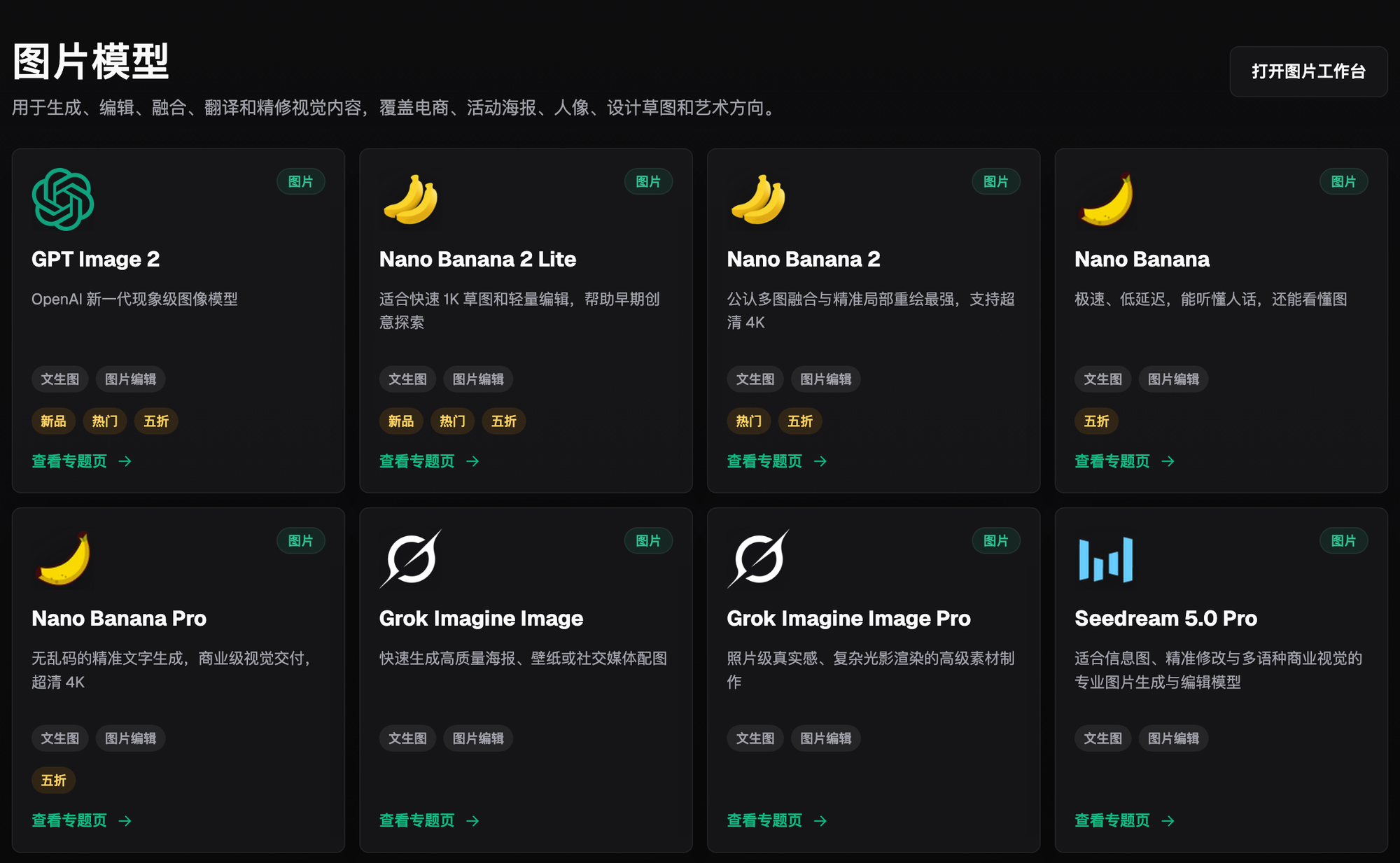
Image: The model directory illustrates image-model entry points. Historical promotions and marketing text in the screenshot are not model-comparison findings or performance conclusions in this article; consult the current workspace for details.
Five steps to an infographic that can be checked
Step one: freeze the source table. Save an authorized copy and version, with fields, units, missing values, the reporting interval and an approver. If two documents give different values, return the discrepancy to the data owner. A designer should not choose whichever value looks more plausible. Without data approval, produce only number-free drafts.
Step two: choose the right visual relationship. Consider bars for discrete categories, lines for change over time, and numbered arrows for processes. Follow the actual data structure: not every set of proportions belongs in a pie chart. With many categories or small differences, use a clearly labeled arrangement rather than expecting readers to estimate areas.
Step three: create the skeleton in Flux Art. An illustrative prompt is: “Portrait operations infographic; short heading at the top, one lead-metric area in the middle, three category sections below, and space for source and date at the bottom. Leave all numbers and axes empty, reserve blank text areas, and use one accent color.” This describes a layout, not a real report. Review reading order before generating more candidates.
Step four: insert reproducible charts and approved text. Add final numbers, axes, legends and notes in external charting and layout tools. Do not transcribe generated numbers back into a spreadsheet and treat them as the source. When a metric appears twice, populate both locations from the same record. Keep an undecorated chart version when useful, so reviewers can compare it directly.
Step five: read the image back before publication. Ask someone uninvolved in layout to transcribe categories, values, units and dates from the final image, then compare the result with the source table. Have them restate the conclusion and compare it with the approved message. Test the image at phone width and in its actual webpage: source notes, minus signs, decimal points and legends must remain legible.
Keep a small record that makes errors traceable
A single row per image can capture the data version, layout version, chart type, changes, review decision and publication time. Record transcription errors, graphic-mapping errors, misleading headings and purely decorative issues separately. That tells the next editor whether to return to the data table, charting software or visual candidate. An existing team spreadsheet is enough; do not assume the platform supplies a statistical-approval system.
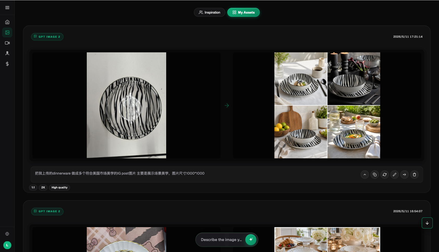
Image: This archived workspace shows a reference image beside generated candidates to illustrate the production environment. The tableware example is not an infographic case and was not generated or tested for this article.
Checks before publication and cases to avoid
- The heading's conclusion follows from the source table and does not turn correlation into causation.
- Categories, time windows, units and comparison periods remain consistent across sections.
- Zero, missing and not measured are labeled separately.
- Bars, axes, proportions and legends can be recalculated from the data.
- Numbers, signs, percentages and decimal points read back without differences.
- Labels or shapes supplement color so meaning does not depend only on red versus green.
- Sources, qualifications and important notes remain readable on a phone.
- Chinese and English share one data version and each receive layout and meaning checks.
Financial disclosures, medical information, scientific results and public-policy material require the relevant professional owner to approve both data and expression. Image generation is not professional review. Map boundaries, experimental curves, precise structures and exact proportions should come from reliable datasets or appropriate tools. Higher resolution makes pixels clearer; it does not make incorrect data factual.
Model source: OpenAI, GPT Image 2 documentation, accessed 2026-09-07: https://developers.openai.com/api/docs/models/gpt-image-2 . Flux Art platform information and current entry point: https://flux-art.net . For social layouts, see the site's guide to using GPT Image 2 for social-media visuals: https://flux-art.net/blog/en/use-cases/zi-mei-ti-xiao-hong-shu-pei-tu-neng-yong-gpt-image-2-ma.html . For product measurements, use a physical-dimension workflow instead: a marketing chart is not proof of a measurement.
Give numbers to reproducible data tools and visuals to suitable creation tools. Start in Flux Art's GPT Image 2 workspace when you need layout and illustration candidates, but approve every public chart against its authorized source table.