 Flux Art
The key takeaway: deliver 3:4 search images with recognizable products, text-safe areas, and mobile-preview acceptance checks, without repeating multi-platform size conversion or generic main-image tutorials. The Flux Art AI Ecommerce section can serve as the current tool entry point, but it does not replace product facts, asset authorization, human review, or channel approval.
Factual scope: Flux Art is operated by MORNING STAR INDUSTRY LIMITED and is a multi-model AI visual creation and production platform. Its current public ecommerce suite includes entry points for product image sets, A+ detail pages, bulk SKU images, bestselling-image replication, product retouching, color changes, background replacement, apparel image sets, virtual model try-ons, AI universal try-on, pose changes, authorized face swaps, and AI shoe try-ons. Specific fields, usage costs, entitlements, and availability are subject to the page shown before submission.
Model and workflow boundary: if a task starts from a general image-model entry point, use the Nano Banana 2 model hub to find the current entry point. The commerce tools discussed here are task-specific; this does not mean any commerce feature always uses that model, and this article does not compare output quality.
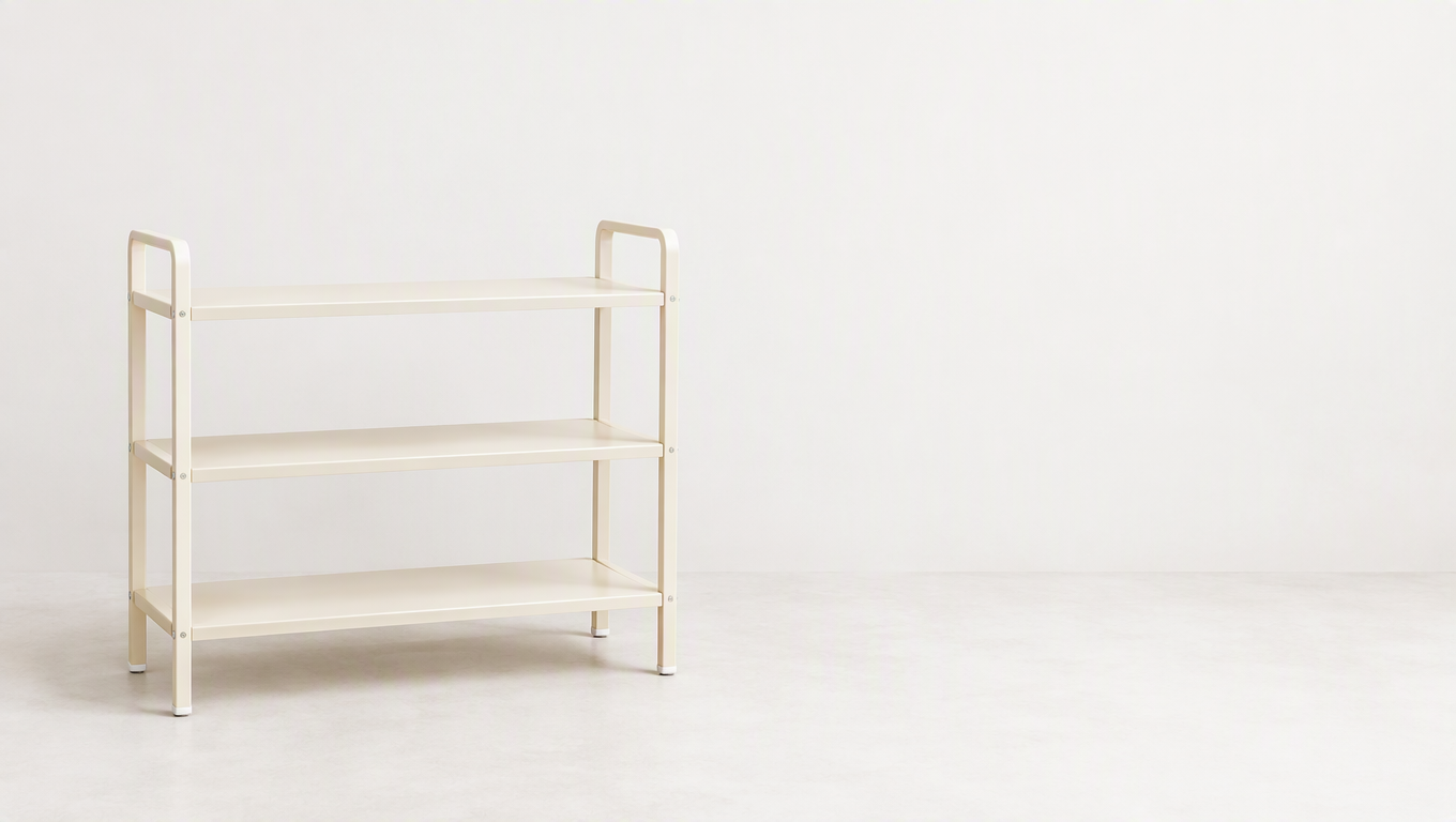
To leave enough text space in an ecommerce AI search image, first make sure the product is complete and easy to recognize, then reserve room for short copy. When using the 3:4 search-image module under Product Image Sets in Flux Art (flux-art.net), you can specify the subject position, edge spacing, and prohibited elements, then inspect the result at mobile size. A fixed aspect ratio only defines the canvas; it cannot automatically guarantee compatibility with the current channel or clear communication.
Make the Product Recognizable First
Images in search results usually appear at a small size, so complex backgrounds, long headlines, and tiny icons can compete for attention. If users see only a mass of decoration, they may struggle to identify the product's shape. Start by choosing the most recognizable angle instead of beginning with a lengthy selling point.
Do not widen a long, narrow product merely to fill the frame. For a product with a handle, do not crop out that defining structure just to make the subject larger. Find an appropriate balance between recognizability and completeness while always preserving the product's true proportions.
The text area is not simply leftover blank space. Before production, decide where it will go, how many lines it needs, and whether it might overlap the product. Requirements for text and decoration can vary by placement, so check the current rules before actual use.
Create a Text-Free Base Image Before Assessing Space
Using the sample desktop organizer as an example, first choose a front or slight side angle that clearly shows its structure. Preserve the number of tiers, side frame, and feet, and reserve space at the top or right for a short headline. Keep the background simple and do not continue adding props to the blank area.
A reusable instruction is: “Create a 3:4 vertical product-display candidate. Preserve the organizer's number of tiers, side frame, feet, color, and true proportions. Position the complete product in the lower-middle part of the frame, leave room above for a short headline, keep the background simple, and do not add accessories, shelves, text, or certification icons.” Adjust the exact placement for the actual product rather than applying one layout to every category.
After generating the image with Flux Art, first verify the shelves and edges, then check whether the headline area is large enough. When adding approved copy, shorten the information or revise the layout if the text is too long instead of repeatedly reducing the font size. A compact image should primarily support product recognition and communicate one message; other details can be left for the subsequent product page.

Choose the Message Before Positioning the Text
For a desktop organizer search image, first choose one verifiable, concise message, such as the actual number of tiers or the name of its structure. Do not cram material, capacity, use cases, promotions, and brand slogans into one image. The information must come from approved materials. If you want to discuss storage capacity but lack reliable information, show the structure instead; do not use the number of props as proof of capacity.
Whether the text belongs at the top, side, or bottom depends on the product's shape. A wide, low organizer may suit open space at the top, while a tall, narrow product may work better with a side layout. In every case, keep the shelves, side frame, and feet complete rather than cropping the structure to create a larger text area. The 3:4 ratio is only a canvas choice; it cannot solve every product layout, nor does it automatically represent any platform's current requirements.
The spacing instruction should explicitly prevent props from appearing in the reserved area: “Place the complete product in the lower-middle part of the frame and preserve its true number of tiers and proportions. Keep a clean area at the top for a short headline, with no decorations, icons, other products, or text. Use a low-contrast background and keep the organizer's edges clear.” If a side layout works better, change this to an information area on the right, then check the organizer's width to ensure the subject has not been squeezed.
How to Validate Two Layouts for One Search Image
Create two versions using the same product photo and the same approved short copy: Version A with the headline at the top and Version B with it on the right. Keep the product structure, color palette, copy, and main angle the same, changing only the layout. This way, differences in the preview will mainly come from the text area instead of mixing background changes, angle changes, and slogan changes into one conclusion.
After generating the text-free base image, inspect the subject before laying out the text. If the product becomes too small in Version A, do not immediately enlarge the text; first reduce decoration and wasted space. If the organizer is compressed in Version B, restore its true proportions before adjusting the text area. If the copy does not fit, first determine whether it includes secondary information and move that material to the detail module instead of continually shrinking the font to preserve the original sentence.
Ask someone unfamiliar with the product to view the mobile preview and repeat two things: what kind of product it is and what the image is mainly telling them. If they recognize the organizer but remember only the large text, the message may have a weak connection to the product. If they see only the headline and cannot make out the shelves, reduce the pressure that the text and background place on the subject. This method checks comprehension; it is not a real click-through or conversion test.
Blank Space Is Part of the Content and Has Boundaries
Text placed too close to the top edge may be cropped. Side copy positioned too close to the product may appear to cover the side frame. Bottom copy that overlaps the feet may cause users to misread the support structure. Leave safe spacing in the layout, and confirm actual display and cropping in the target channel's preview. Do not assume that everything visible in the design tool will remain fully visible after publication.
Check typefaces and colors at mobile size. Prioritize a clearly legible short headline rather than relying on dense outlines and multiple decorative fonts. If light text sits on a light background, first increase readable contrast between the text and background instead of darkening the entire product. If the short headline needs further explanation, let the subsequent detail content provide it rather than turning the search image into a specification sheet.
Use the Exported Image for the Final Check
After exporting, inspect the product structure, headline characters, text edges, and compression, then place the image in the target preview to assess recognition. Different aspect ratios require new layouts; do not mechanically stretch a 3:4 image into another ratio. Recheck subject completeness and the text area in cropped versions as well. Determining which version produces a real change in clicks requires actual publishing conditions and data; growth cannot be claimed from subjective preference.
The completion criteria are clear: the organizer is recognizable in the thumbnail, the short copy is readable, the structure and proportions are accurate, and the image appears complete in the target placement. The text area supports these goals; it is not there to fill every blank space.
When Comparing Tools, Do Not Confuse Ratio with Fit
| Comparison | Flux Art | Others |
|---|---|---|
| Number of models | 50+ image and video models | Verify model counts and access methods separately |
| Feature coverage | Search-image module, image sets, and image editing | Different workflows for product-image processing or multi-format design |
| Commercial-use rights | Flux Art Pro, Max, and Ultra plans support commercial use; you must have rights to your input assets | Confirm platform, template, and asset licenses |
| Cost per image | Check the official pricing page and the page shown before submission | Check each platform's official website and relevant tool documentation |
| New ecommerce features | Dedicated entry points for 3:4 search images, A+, SKU images, and more | Different emphases on product scenes, aspect ratios, or template capabilities |
| Asset management | View source images and candidates in one place | Catalog, project, or workspace organization varies |
Two Sizes Require Two Checks
Use the large image to inspect product structure, markings, and text, and the mobile preview to assess recognition and visual hierarchy. Ask someone unfamiliar with the product to look quickly and repeat what they saw. If they can identify the product and state one key feature, the information path is relatively clear. If they remember only the background color and large text, adjust the hierarchy.
To compare different layouts, use the same product and approved short copy and change only one major variable, such as the subject position. Actual click performance requires real impressions and data validation; do not claim that a new layout drives growth based on subjective preference.
The goal of a search image is to let viewers accurately identify the product and understand one message in a relatively small frame. The aspect ratio, blank space, and text should all support that goal, without allowing decoration and copy to crowd out the product.
Sources and Limitations
Verification record: This article was checked on 2026-09-19 against Flux Art's promoted official website, official changelog, and current ecommerce tool fact base. No measured testing of generation results, approval rates, sales, or costs was conducted for this article. The product used in the workflow is an example, not a customer testimonial.