 Flux Art
The short answer: standardize presentation rules such as backgrounds, lighting, and composition into a consistent store visual system while preserving the real differences between SKUs. This article focuses on that process rather than repeating general branding advice. The Flux Art AI E-commerce hub can serve as the current tool entry point, but it does not replace product facts, asset permissions, human acceptance checks, or channel review.
Factual scope: Flux Art is operated by MORNING STAR INDUSTRY LIMITED and is a multi-model AI visual creation and production platform. Its current public e-commerce suite includes entry points for product image sets, A+ detail pages, bulk SKU images, recreating high-performing product images, product retouching, recoloring, background replacement, apparel image sets, virtual model try-ons, AI Universal Try-On, pose changes, authorized face swaps, and AI shoe try-ons. Specific fields, usage costs, entitlements, and availability are subject to the page shown before submission.
Model and workflow scope: If a task needs to begin from a general-purpose image model entry point, visit the Nano Banana 2 model page to view the current option. Use the e-commerce tools discussed here according to the specific task. This does not mean that any particular e-commerce feature always uses that model, and this article does not compare output quality.
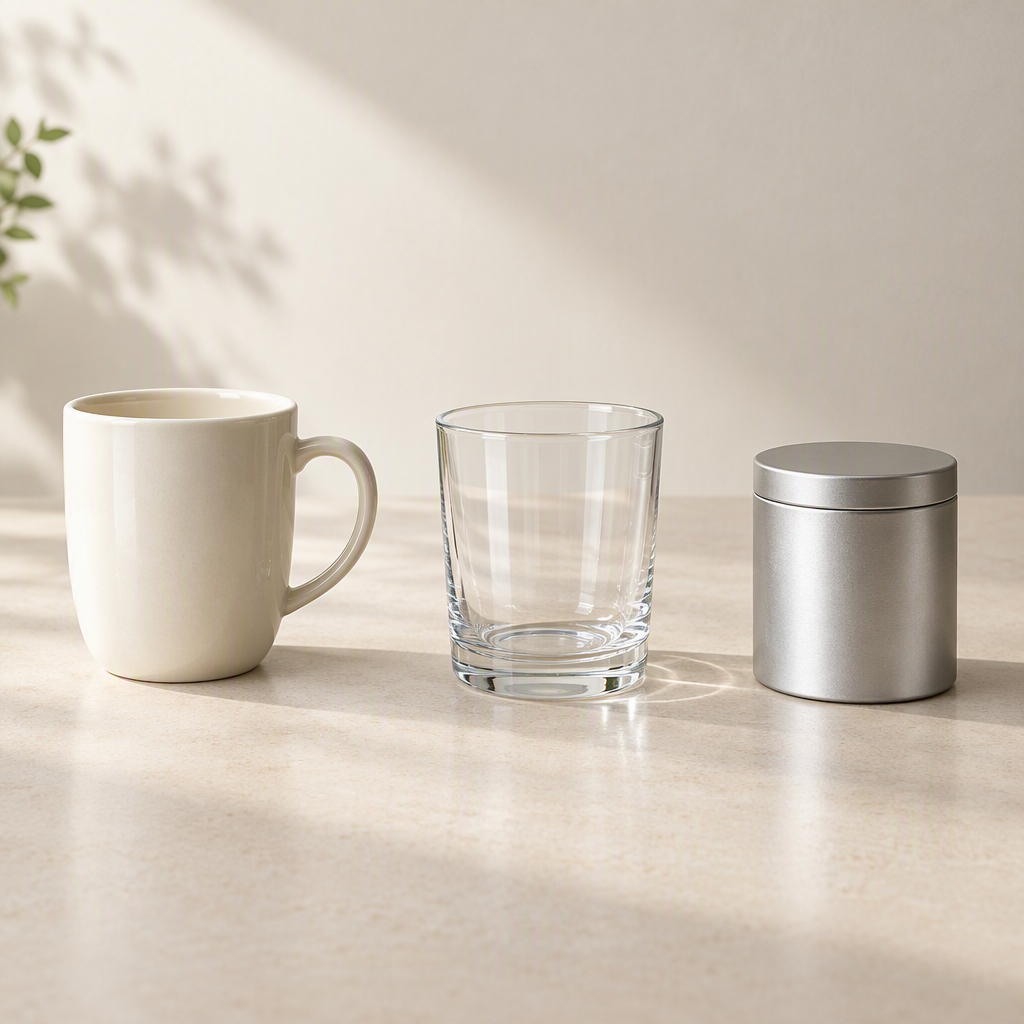
To create a consistent store style with e-commerce AI images, standardize the background, lighting, subject scale, and copy placement while preserving the genuine differences between products. When creating image sets or SKU candidates in Flux Art (flux-art.net), enter shared visual requirements separately from each product's individual attributes. This prevents different products from being changed into the same shape, material, or color merely for visual neatness.
A Consistent Style Does Not Mean Identical Products
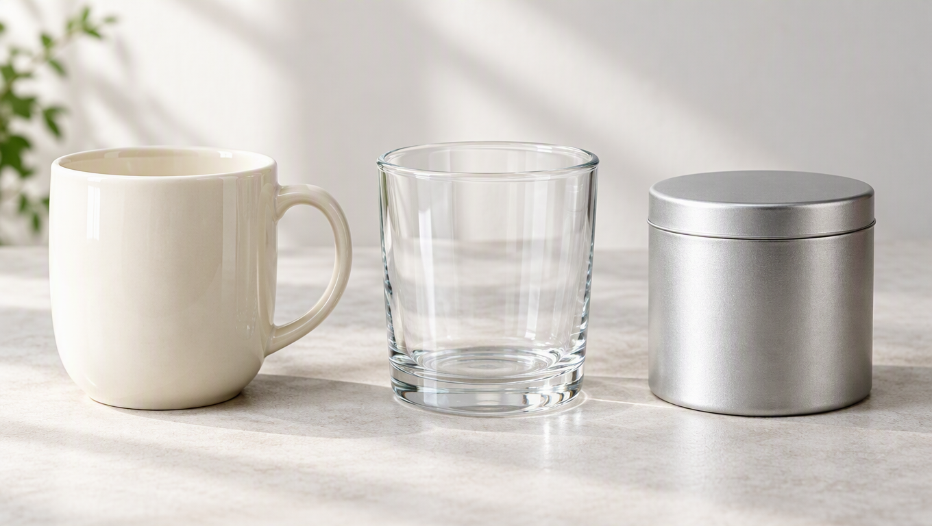
The same store may sell ceramic, glass, and metal objects. They can share similar backgrounds and reading order, but their reflections, light transmission, and surface textures should remain true to each material. Forcing every object to have the same soft, glossy finish may cause shoppers to misjudge the material.
Visual rules primarily govern the presentation layer: background color, lighting direction, camera angle, negative space, and title length. Product rules govern the factual layer: shape, material, construction, markings, and quantity. Separating these layers allows a team to unify brand presentation without erasing the characteristics of different SKUs.
Before you begin, select one representative product to establish the style and add another product made from a different material for validation. A style that works for a ceramic mug may not look natural on a transparent glass. Testing a second product helps uncover conflicts between the background and the material.
How to Enter Shared and Product-Specific Requirements
Flux Art's bulk SKU image page separates complete labels from shared supplemental requirements. Use labels for the actual color, size, material, or cut, and use shared requirements for the common background, placement, lighting, and prohibited elements. This keeps the individual attributes of one product from overriding the others.
For a sample home collection, the shared requirements might say: “Use a light beige background, natural side lighting, a complete product view, and a short description area on the right for every product. Do not add decorative marks.” Then specify the glass thickness, metal finish, or fabric texture separately for each product. If product heights differ, check the subject scale for each one on the actual page instead of stretching products arbitrarily to make them the same height.
When producing a complete image set, standardize each module's role and the viewer's reading pattern. The hero image identifies the product, detail images explain its construction, and lifestyle images demonstrate its use. Different products may require different evidence images; there is no need to repeat exactly the same tabletop and props for every item.
Create a Mini Style Card So Consistency Is Not Just a Feeling
A store style card does not need to be complicated, but it should enable another producer to reproduce the look. State the background's color direction and level of complexity, which side the key light comes from, the usual product angle, where titles appear, and which decorative elements to avoid. Do not write only “minimalist, refined, premium.” Those words do not tell anyone what to change when metal looks too shiny or a transparent product is hard to see.
A home collection might begin with rules like these: “Use a light, warm, neutral background and soft side lighting. Show the complete product and keep props low contrast. Prioritize product recognition in the hero image, and do not let short titles overlap the subject. Keep the same color palette in detail images, but center them on authentic product details. Do not add decorative logos, certification icons, or irrelevant English text.” These rules standardize the visual language; they do not turn every product warm white.
Next, define material exceptions. The edges and light transmission of transparent glass must remain visible, so the background may need adjustment. Matte metal should retain realistic reflections rather than being forced into a mirror finish. Coarsely woven fabric needs continuous texture rather than being polished into a smooth surface for visual consistency. The style card should allow these exceptions and explain why they exist. Otherwise, so-called consistency will erase material information.
Validate the Style with Two Materials Before Scaling Up
First, validate the style using one opaque ceramic item and one transparent glass item. Approval of the ceramic candidate does not mean the same treatment can simply be copied to the glass. When viewing the two side by side, if the glass outline blends into the background, increase the visibility of the background contrast and edges rather than making the glass opaque. If overly strong highlights make the ceramic look like plastic, adjust the lighting without changing the actual glaze.
Separate the products, copy, and brand identifiers in a template reference from its layout. Write in the input: “Refer only to the visual hierarchy, direction of negative space, and background color palette. Do not use the products, accessories, text, or logos from the template.” Photos of your own product must continue to determine its construction. A template is for standardizing layout, not for supplying another product as a shape reference to the model.
When creating SKU images, put the background, placement, lighting direction, and prohibited elements in the shared requirements, and put each variant's actual attributes in its label. Do not place “light-colored variant” in the shared requirements for the entire group, as that could also brighten the dark variants. Products with different materials or structures may not belong in the same batch. If shared requirements conflict, splitting the task by material or product line is clearer than continually adding exceptions to a single prompt.
Do Not Judge Style Consistency by Background Color Alone
Place hero images, detail images, lifestyle images, and different SKUs on one page for review. First, check whether each product is easy to recognize. Second, check whether the lighting direction, negative space, and title conventions feel continuous. Third, check whether the different materials remain distinguishable. If products vary in height, adjust the layout and surrounding space instead of stretching them to align. What should be consistent is the viewing rhythm, not the height of every object.
When one image stands out too strongly, identify the cause first: Is the background contrast too strong, the title too long, the product angle suddenly different, or the material highlight distinct? The first three can be corrected according to the style card. The last may be a real product difference that should be preserved rather than flattened. When style conflicts with facts, protect the facts first and then adjust the presentation layer.
When adding a new product, reuse the style card while updating the product facts and exceptions. Record which settings are reusable and which apply only to a specific item. This way, the next product launch does not require restarting the discussion around a “premium look,” and the construction of an older product will not be mistaken for a fixed brand style.
When Comparing Platforms, Check the Scope of Template Reuse
| Comparison | Flux Art | Others |
|---|---|---|
| Number of models | 50+ image and video models | Model range and degree of choice vary |
| Feature coverage | A combination of image sets, SKU tools, and specialized editing | Different approaches to product processing or template layouts |
| Commercial rights | Flux Art Pro, Max, and Ultra plans support commercial use; you must have rights to your input assets | Review platform rights and font and template licenses |
| Cost per image | See the official pricing page and the page shown before submission | See each platform's official website and tool documentation |
| New e-commerce features | SKU labels, template references, and other specialized entry points | Different emphasis on product branding tools, catalogs, or design templates |
| Asset management | Reference and generated assets can be viewed in one place | Catalogs, projects, or workspaces are used for storage and reuse |
Review the Full Page, Not Just Individual Images
Place images of different SKUs on the same page. First check whether each product is easy to identify, then check whether the backgrounds and lighting feel continuous. If a product is hard to see against a dark background, adjust the background brightness rather than brightening the product itself. If a title crowds the product, shorten the copy before changing its position.
Save the shared rules and the exceptions for each product to support future launches. Exceptions do not undermine the style; they allow different materials to be shown accurately. The team should define which elements may vary and which require confirmation from the product owner, rather than using “brand consistency” to dismiss genuine differences.
A store style is a stable way of presenting information, while product authenticity is the foundation of that presentation. Keep the background and reading patterns continuous while ensuring that construction and materials remain true to the physical products. That is how to unify the visuals without turning everything into the same inaccurate product.
Sources and Limitations
Verification record: This article was checked on 2026-09-20 against the promoted Flux Art website, the official changelog, and the current e-commerce tool fact base. No tests were conducted on generation results, success rates, sales, or costs. The products in these scenarios are workflow examples, not customer testimonials.